

A customer lands on your custom jewelry product page. They love the necklace. They start looking for where to enter the name they want engraved. They scroll. Keep scrolling. Click a tab—wrong one. Click another. Finally find the customization field buried below three paragraphs of brand story.
By now, the excitement is gone. They leave.
This happens constantly on personalization stores. Unlike regular e-commerce where customers just pick a size and buy, your customers need to find the customization options, understand how they work, see a preview of their personalization, AND feel confident about a product they can't return. Your page architecture either makes this effortless or makes it exhausting.
The Information Hierarchy That Converts
Your page architecture should mirror how personalization buyers actually think—not how your team organized the content.
1. See the product (and what personalization looks like)
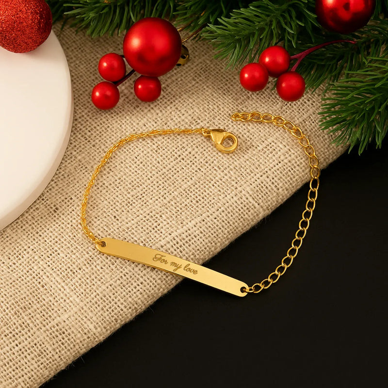
Images come first, always. But for personalization stores, at least one image should show the product WITH customization—an engraved name, a monogram, a photo printed. Customers need to see the end result, not just a blank product.
2. Understand what they can customize
The customization interface needs to be obvious and early. If customers have to hunt for where to enter their text or choose their options, you've already lost some of them. This should feel like the natural next step after seeing the product.
3. Build confidence before asking for money
Personalization purchases are high-anxiety. Customers worry: Will it look right? What if there's a typo? Can I return it? Your architecture must answer these questions BEFORE the add-to-cart button. Proof approval messaging, reviews with customer photos, and clear guarantees need to be visible—not buried in tabs.
4. Clear path to purchase
After confidence is built, the purchase step should be frictionless. Price, delivery estimate, and add-to-cart should be immediately accessible—not hidden below more scrolling.
This hierarchy flows vertically. Every scroll should move customers closer to purchase, not sideways into tabs or subpages.
Where the Customization Interface Belongs
This is the core architectural question for personalization stores. The answer depends on your customization complexity.
Simple Customization (Text Engraving, Monogram)
Place the customization fields directly in the buy section, near variant selectors (size, color, material).
Structure:
- Product images with personalization preview
- Title, price, reviews summary
- Variant selectors (material, size)
- Customization field (name, date, initials)
- Add to cart button
The customer shouldn't scroll to find where to enter their personalization. Keep it simple and integrated.
Medium Customization (Multiple Options, Font Selection)
Create a dedicated customization section immediately below the product images, before the detailed description.
Structure:
- Product images
- Title, price, reviews summary
- Customization section (text + font + style options)
- Live preview showing their personalization
- Add to cart button
- Description and trust signals below
The preview is critical—customers must see their customization before scrolling to purchase.
Complex Customization (Configurator, Image Upload, Multiple Steps)
Use a step-by-step flow that guides customers through choices without overwhelming them.
Structure:
- Product images showing examples of finished customizations
- Title, price, reviews summary
- "Start Customizing" button that opens guided flow
- Step 1: Choose base options
- Step 2: Add personalization
- Step 3: Review preview
- Add to cart
For complex customization, don't try to cram everything above the fold. A clear "Start Customizing" CTA that leads to a guided experience converts better than a cluttered interface.
Tabs vs. Vertical Sections
Never hide essential information in horizontal tabs. Baymard's research shows users consistently miss tabbed content—especially on mobile.
Replace tabs with vertical collapsed sections (accordion-style):
- ✓ Description & Materials
- ✓ Sizing Guide
- ✓ Shipping & Production Time
- ✓ Returns & Guarantees
- ✓ Reviews
Users can expand what they need without leaving the page or missing critical details.
Exception: Image galleries can use horizontal swiping—that's expected behavior.
Trust Signals Placement
For personalization stores, trust signals answer specific anxieties. Place them where anxiety occurs.
Near the Price
- "Starting at $X" with customization cost clarity
- Production timeline ("Ready in 5-7 days")
Near Customization Interface
- "You'll approve a proof before we create it"
- "Free unlimited revisions on your design"
- Sample preview of what the proof email/page looks like
Why this matters: The proof approval process is one of your biggest trust builders. Customers worry about typos, wrong fonts, or designs that don't look right. Telling them they'll see and approve a digital proof BEFORE you make anything removes this fear. But many stores bury this in FAQs or don't mention it at all. Put it right next to the customization field.
In the Buy Section
- Guarantee badge ("100% satisfaction guaranteed")
- Secure checkout indicators
- Return policy summary (even if limited for custom items)
Below Buy Section
- Full reviews with customer photos
- Detailed guarantee/policy information
- FAQ for common questions
Don't save your best trust signals for the bottom. Reviews summary, guarantees, and proof process messaging belong in the upper half of the page.
Mobile Architecture
Over 50% of your traffic is on mobile. Your page must work vertically—but mobile customization has unique challenges.
Sticky Buy Bar
Add a sticky bar at the bottom of mobile screens showing:
- Price (with customization total)
- "Add to Cart" button
- Estimated delivery date
This keeps the purchase path visible as customers scroll through details.
The Mobile Customization Challenge
Some customization interfaces that work beautifully on desktop become painful on mobile:
- Image upload: Works fine on mobile (uses phone camera)
- Text engraving: Works fine (simple input field)
- Font/style pickers: Can work if designed with large touch targets
- Complex configurators: Often frustrating on small screens
Be honest with yourself: if your customizer requires precise clicking, comparing many options side-by-side, or has tiny text, mobile customers will struggle.
Options:
- Simplify the mobile customizer (fewer options, larger buttons)
- Show a "For best experience, customize on desktop" message
- Let customers save their cart and email themselves a link to finish on desktop
Don't pretend a complex desktop experience will work on mobile if it doesn't.
Mobile Information Flow
On mobile, everything stacks vertically. Prioritize:
- Main product image (swipeable gallery)
- Title, price, reviews summary
- Customization interface (or "Customize This" button)
- Live preview of personalization
- Add to cart
- Collapsed sections for details
Don't force mobile users to hunt for information in submenus or separate pages.
Touch-Friendly Design
- Large touch targets (minimum 44px)
- Adequate spacing between interactive elements
- Swipe-enabled image galleries
- Easy-to-tap collapsed sections
What Good Architecture Looks Like: An Example
Here's how a well-architected custom jewelry product page flows:
First viewport (no scrolling):
- Large product image showing the necklace WITH a sample name engraved
- Product title: "Custom Name Necklace"
- Price: "Starting at $79"
- Reviews: "4.9 ★ (312 reviews)"
- Swipeable gallery hint showing more images
Second viewport (one scroll):
- Metal selector: Gold / Silver / Rose Gold
- Text field: "Enter name (up to 10 characters)"
- Font selector: 3 options with visual preview
- Live preview image updating as customer types
- "You'll approve a digital proof before we create it"
Third viewport:
- Add to Cart button (prominent)
- Price summary including customization
- "Ships in 5-7 business days"
- "Free shipping" / "Hassle-free returns for non-personalized items"
- Security badges
Below the fold (collapsed sections):
- Description & Materials
- Sizing Guide
- Customer Reviews (with photos)
- Shipping & Returns detail
- FAQ
The customer sees the product personalized, customizes their own, builds confidence, and buys—all without hunting through tabs or getting lost.
Viewport 2: Customize it (text + font) with live preview
Viewport 3: Clear CTAs + trust signals
Below fold: Details in expandable sections for those who need them
Common Architecture Mistakes
The Tab Trap Hiding product details, shipping info, or reviews in tabs. Users miss this content—especially on mobile.
Buried Customization Placing the personalization interface below multiple scrolls or inside a tab. If customization is your differentiator, it should be prominent.
Hidden Costs Burying production fees, shipping costs, or delivery timeframes in footer links. This information must be easily discoverable from the main page.
Cluttered Buy Section Stuffing the purchase area with wishlist buttons, social sharing, size charts, and policy links. Keep it focused: options, customization, price, buy button.
Missing Proof Messaging Not telling customers they'll see and approve their design before production. This is a major trust builder that many stores forget to communicate.
Quick Checklist
Customization Placement:
- [ ] Simple customization integrated in buy section
- [ ] Medium customization has dedicated section with preview
- [ ] Complex customization uses guided step-by-step flow
- [ ] Preview visible before customers reach add-to-cart
Page Structure:
- [ ] Vertical sections instead of horizontal tabs
- [ ] Information hierarchy: images → customization → trust → purchase
- [ ] Mobile sticky buy bar with price and delivery estimate
- [ ] Reviews summary in upper half of page
Trust Signals:
- [ ] Proof approval process mentioned near customization
- [ ] Production timeline visible near price
- [ ] Guarantee/return policy in buy section
- [ ] Customer photos in reviews section
Key Takeaways
Product page architecture for personalization stores centers on one question: where does the customization interface live? Match your architecture to your customization complexity—simple fields integrate with the buy section, complex configurators need guided flows.
Never hide information in tabs. Vertical sections work better on all devices, especially mobile.
Place trust signals where anxiety occurs. "You'll approve a proof before we make it" belongs near the customization interface, not buried in FAQs.
Mobile architecture must flow vertically with a sticky buy bar that keeps the purchase path visible.
Get architecture right, and everything else—your images, descriptions, and customization tools—will perform better.
Next up: Visual presentation excellence—the images and media that sell personalized products.
